Three years ago, in the summer of 2021, I relocated to the UK from Nigeria. At the time, I was six months into my Master's in User Experience Design program at Kingston University London. Simultaneously, I was trying to integrate myself into the London tech scene by securing a part-time design role as soon as possible—after all, that was the main reason I left everything behind in Nigeria to start 'almost' afresh. Part of starting afresh involved taking any UX design roles that would pay me whatever for 20 hours of work a week while I continued with my master's. I thought it would be easy to land a role given my five years of experience as a UX designer and having led a design team for about half of that time, but it was incredibly difficult. I stopped tracking my applications at some point because the rejection emails kept coming, and I wasn’t even receiving invitations for interviews, so I knew something was wrong with either my resume or my portfolio—or both.
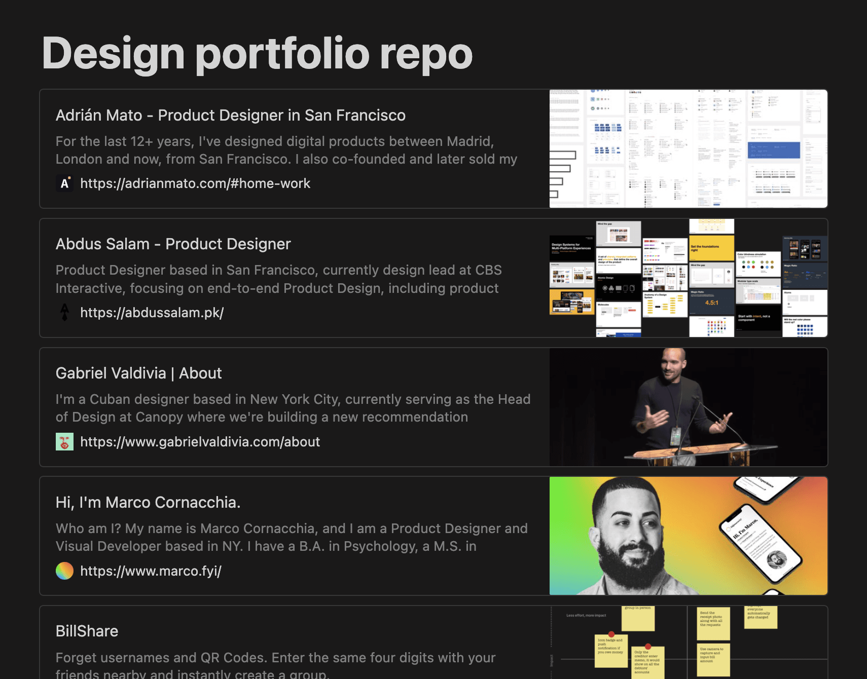
My resume was fully optimized to yield the best results, so the issue had to be my portfolio. I began searching for really good design portfolios online, curating them in a Notion document to inspire me. My rule of thumb for a good portfolio is any portfolio that holds my attention for more than five minutes. Some of the earliest portfolios I found were from Brian Lovin’s catalog. Brian is an incredible designer who is now the founder of Campsite, a team communication tool. He has an eye for good design, and I trust his judgment—if Brian thinks a portfolio is worth curating, then it is. Collecting and studying a few portfolios helped me understand how some of the best product designers showcase their work, and I drew inspiration from various sources to redesign my portfolio. It worked! The rejection emails reduced, I started receiving interview invitations, and in July 2021, I landed my first part-time role with Xplora, a company creating a secure alternative to smartphones for children using smartwatches and gamified apps.

My portfolio curation exercise didn’t stop there. I had fallen in love with the process of digging into how other designers present their work. It became an easy way to keep my inspiration in flow state. It has gone beyond just getting inspired to improve my portfolio to understanding how the best designers think and present their work. Two years into curating these portfolios, I have now collected over 100 portfolios in more than 100 Notion blocks from designers at big tech companies like Instagram, Twitter, Netflix, and fast-growing scale-ups like Monzo, Discord, and Vercel. Personally, my favorite part about curating these portfolios is seeing the representation of great portfolios from designers from all over the world. The concentration of big tech and startups in America and Europe might make it seem like that’s where all the design talent is, but I have come to realize that talent is evenly distributed globally, sadly, opportunity is not.
"I have come to realize that talent is evenly distributed globally, sadly, opportunity is not.
Becoming Foleo
I shared the Notion page where these portfolios are curated with a few designer friends, and I started to receive feedback on how helpful going through these portfolios had been for them in pushing past the creative block of creating their own portfolios and how they’ve increased their chances of landing interviews for jobs they had applied for. I also had proof because their avatars on Notion were active, so I knew they had been visiting the document. It only made sense to make it a resource available publicly, so I started to think about the lowest effort approach to publishing it online. I had very little spare time to dedicate to developing a website, and I needed an unreasonable amount of time to write ‘Hello world’ in code—I'm sorry, I'm not the unicorn designer you might think I am. But then, I heard about Framer and its website design capabilities and was completely sold.
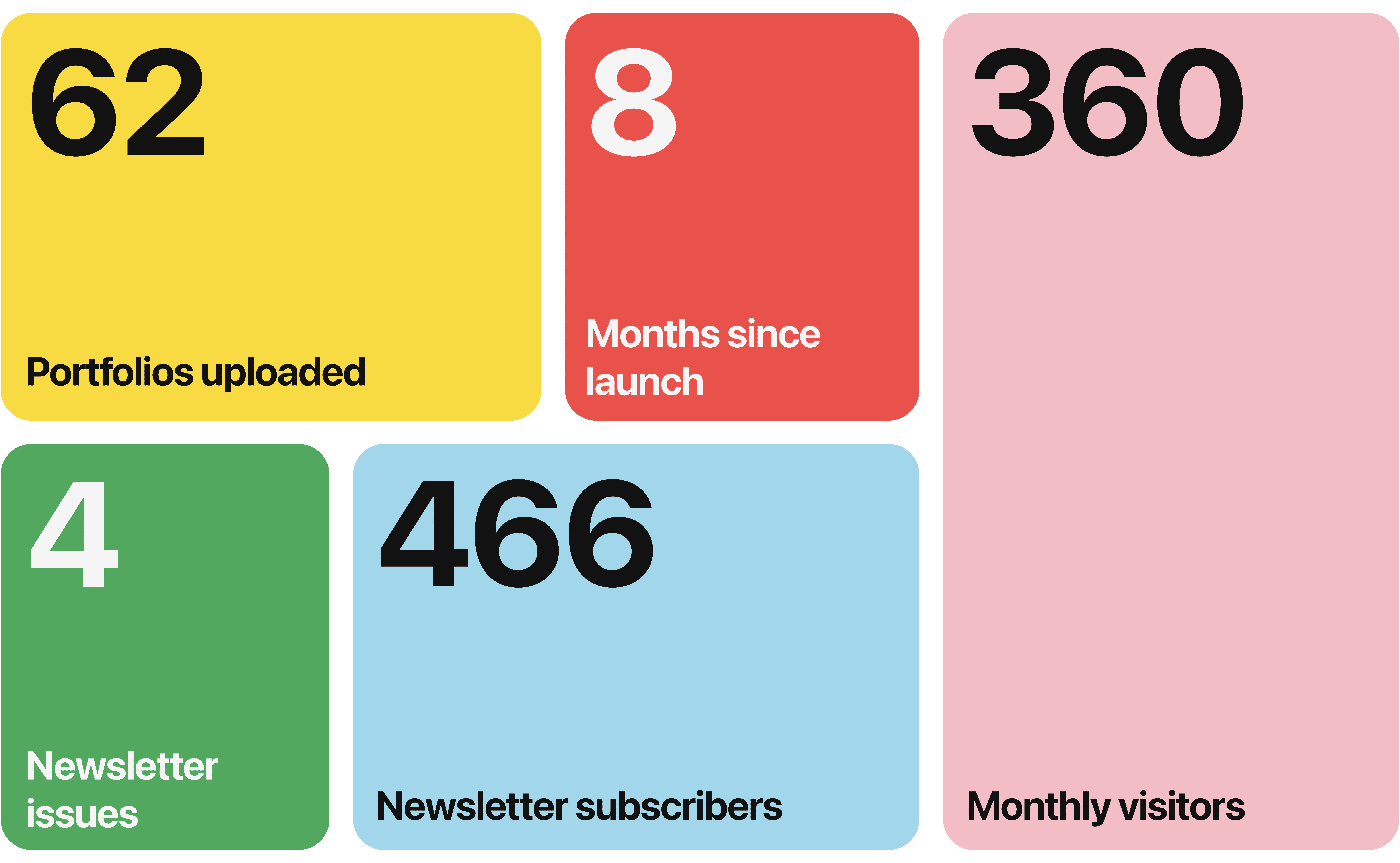
Using Framer, I created a waitlist page which garnered a few hundred sign-ups, and I moved the best 30 portfolios from the Notion page to a published Framer site—Foleo is now live. When connected with other tools, Framer becomes a powerful tool to get your website up and running quickly. I use Mailchimp to send monthly newsletters to subscribers, Airtable to collect feedback and portfolio submissions from visitors, Google Analytics to track usage metrics, and Framer CMS to upload new portfolios periodically, all without writing a single line of code.
"The goal is to build a platform where budding designers can learn from the real-world experiences of world-class designers and be inspired to be world-class.

So far, there are over 60 portfolios on Foleo, each showcasing very high-quality work from some of the world's best designers. Design portfolios are just the beginning—there’s a lot more coming to Foleo soon. The goal is to build a platform where every type of designer can learn from the real-world experiences of world-class designers and be inspired to be world-class.

